Osu, Accra, Ghana
Travel Promotional Neighborhood Campaign
CLIENT/INDUSTRY: School Project
MEDIUM: Digital
SOFTWARE: Illustrator, Clip Studio, After effects
DELIVERABLES: Digital Assets
TARGET AUDIENCE: Millennial travelers
This project was a hypothetical Neighborhood travel campaign for Osu Accra. Osu is a cosmopolitan area of Accra, Ghana, with bustling markets, speakeasy bars, nightlife, easy access to the coast and the city center, and the best of both worlds in quiet retreats and upscale city luxuries. The primary aim is to attract millennial travelers considering more exotic travel post-COVID. The campaign's focal point is a new logo representing Osu. It will be used in outdoor signage, print, and subway ads in NYC, Toronto, and London. Additionally, a series of IAB display ads will run in the United States, Canada, and the UK's pre-eminent news websites.
IDEATION

SKETCHING EXERCISE
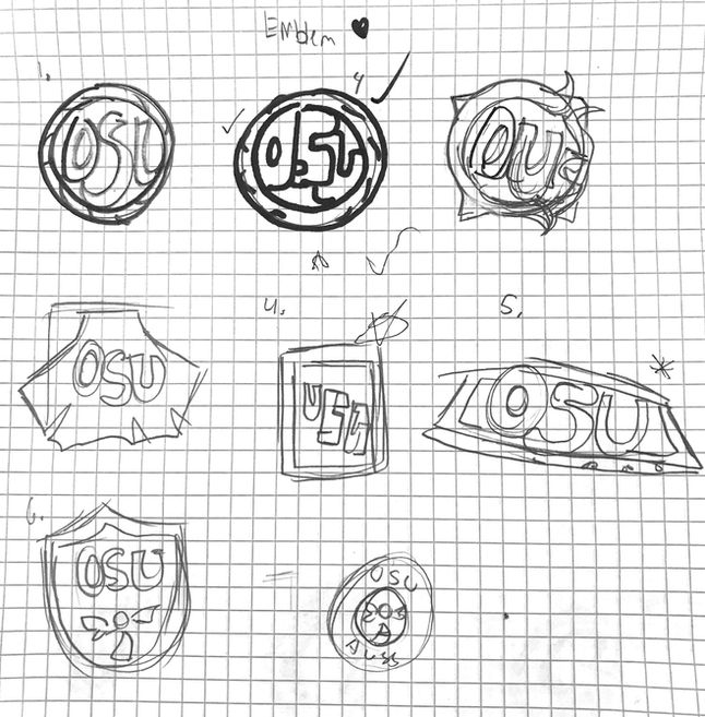
The ideation for this project started with a unique design exercise tasked by the professor. With little context on the neighborhood we were randomly assigned, we were timed to create ten sketches for one logotype before stopping and resetting the time to repeat the process with another logotype. I sketch my ideas for Osu as an abstract mark, mascot logo, combination, emblem logo, lettermark, pictorial mark, and wordmark. After completion, the class went around to vote on the strongest sketch idea, and for me, it was one of my emblem sketches. Keeping this in mind, I went forward to start creating drafts.
LOGO DRAFTS

DRAFTS
Using the Ghana flag and colors in the logo stuck with me. The flag was iconic and colors vibrant that they would perfectly resonate with millennial travelers. I started incorporating the multiple-pointed star into logo drafts to represent the flag's star. Not wanting to copy the start exactly, I leaned towards a sun-star motif that would fit in the emblem circle.
FINAL LOGO LOCK UP

FINAL DECISIONS
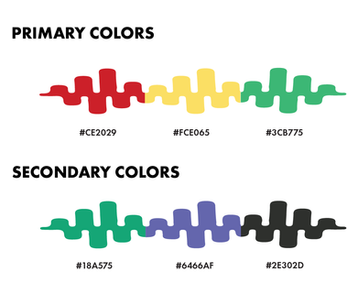
After feedback, the final logo uses the traditional five-pointed Ghana star and keeps the vibrant country flag colors incorporated from the drafts. The secondary color palette is of darks, purples, and green to represent the "nightlife" of Osu. After talking with other students assigned to the Osu Neighborhood, the tagline "Let the rhythm of life guide you to Osu" was created. It perfectly portrayed the neighborhood's active and spirited culture in the form of a call to action. With the theme of rhythm and movement, I created a wave-like symbol that is incorporated into the logo. This symbol will later become a repeating element in the design.

IllUSTRATION & PATTERN

PERSONAL TOUCH
Wanting to incorporate a more illustrative element, I researched and created with the help of photo references illustrations referencing the neighborhood's iconic landmarks, cuisine, and a club scene that would reflect the nightlife. Each Illustration is done in the color palette of the corresponding letter they were to fill. To keep with the theme of movement, I used the wave rhythm symbol and created a repeating pattern to represent it.
MOCKUPS

IBM ADVERTISEMENT MOCKUP


